PowerPoint PresentationWeek 7-Security, Accessibilit... (Links to an external site.)Links to an external site.Perform a heuristic evaluation of the usability of your web store, using the Mac Vision
Running head: WEBSITE CRITIQUE PROJECT 0
Webstore Design layout 6
Websites are platforms of different site pages that are altogether related and can be reached by visiting the homepage through the use of a web browser. They are some of the best ways through which people, organizations, and businesses can interact and communicate with end users freely. Even though most websites may look different, they are purposefully designed to inform, entertain, or sell a particular product. Typically, an ideal website should serve the needs of the visitors and should operate efficiently and effectively. Experts in the field argue that a good website should have appropriate information architecture from the perspective of its organization, labeling, and navigation (Woodardm et al, 2018). This is what an ideal website should be made up of; a website that is properly organized, labeled, can be easily navigated, easy to search, and use. This review provides a critique of B2C e-retail web store, reviews how the web store addresses the information architecture from the perspective of its organization, labeling, and navigation, how well the website meets these functionalities and how the functionalities can be improved.
The organization is one of the most fundamental elements of a good website. In reference, the B2C e-retail web store for the gym is well organized and has a proper design that makes it appropriate for the end users to navigate the website easily. The content of my website, www.Mac_Vision.com, is provided as well as using clear, logical information structure. Only the contents that are relevant for the users are provided, ensuring that the relevancy of the site is maintained. From the homepage to other pages, only information related to the gym is displayed. More ever, the goals of the sites can be seen from the homepage. It is easier for the user of the site to recognize that the site is purposefully for the gym. Down the page, the information has been tailored in a way that the users can understand the minor details of the sites. The figure below shows how additional information has been included at the bottom of the page.
Figure 1: Additional information at the bottom of the website
Further, the information on the site is arranged in order of importance from the top of the page and homepage to the bottom of the page and other linked pages. The information is broken down from the most critical to the least critical. The homepage offers a clear starting point where the user can acquire the necessary information about the gym materials and resources needed to get a start of the business. They are organized uniformly to show that after the homepage information, other related information such as less central content. By ordering this information in order of importance, it becomes easier for users to access and suit the purpose of the website (Kassim, & Idris, 2018).
Additionally, the homepage of the website also looks great. It has little information that does not burden the user. In this way, it also becomes more comfortable for the users to access the information on the website without being overloaded. At the bottom, most of the page, there is added information that user can resort to in order to access additional information that is provided or cannot be easily accessed. However, this website can be improved by incorporating various elements that are currently missing. Pertinent information could be organized in groups to ensure that the users are subjective and goal oriented. It would also be beneficial and efficient for users to make several entry points and offer customization.
The information architecture of the website could also be analyzed by looking at the navigation of the website. The B2C e-retail web store is easily navigable. At the top of the page, there is a horizontal navigation bar that gives the website an easily navigable page and also makes it easier for the users to use the website. The information on the website is also written from left to right in the usual and natural way and also makes it easier to use. At the bottom of the page, a secondary horizontal bar reoccurs and repeats the links in the same way as that of the navigation bar at the top. The website also incorporates hyperlinks that are signposted transparently so that the users can navigate the websites effectively. Also, there are active links provided at the top of the page that move repeatedly and can take the users to other pages directly without the intervention of the third party. However, this website can become more productive if more intra-linking are provided. These links could make the website users to be contained within the website and could also facilitate the creation of more hits. Further, this website could become more effective if a hyperlink like “where am I?” is provided at both the top and bottom of every page. By so doing that, the hyperlink could aid in tracking every page that the user visits by recording their history to make it easier for every user to track backward and to ensure that they do not get lost.
The information architecture of a good website can also be looked at by evaluating the website’s nomenclature. Ideally, a good website should be transparent, sustainable, and with a proper labeling system. The nomenclature or the labeling system of those mentioned above B2C e-retail web store of the gym demonstrates a high degree of the labeling system. Ideally, the website combines all of the elements and types of labels. The document, content, and navigation labels have all been combined in a way that communicates to the users about the content. As demonstrated by the figure below, the scent of the information on the website has been clearly shown in a way that the user is self-directed about the website.
The labels of the website clearly addresses questions like where can the client go (navigation), where is the user currently (orientation), can the user tell if he has arrived at the right destination (arrival), how can the client get to the destination (route selection), if the user can click on any link of the website (content value). Content labels have been used throughout the website to support scan ability when they are scrolled. Content labels such as headings, subheadings, image captions, and headings have been used as shown by the diagram to communicate to the users. However, this website comes short on the usage of navigation labels.
The figure below demonstrates how labeling has been achieved on the website. Even though the labels have been used on the website, they have been used sparingly. It would be efficient when the website adds more navigation labels to communicate content aboutness and information scent (Kumar, Jayaram & Tejaswini, 2018). It would also be useful if more document labels are added to the website. These labels communicate the role of each document on the website. Even though document labels such as titles have been used in the website, others such as the use of URL and file names would add significant value to the website. Regardless, the B2C e-retail web store for the gym has used some of the generally accepted information architecture of a website.

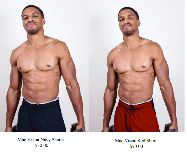
Figure 2: A representation labeling in the website
References
ABRAHAMI, Y., Shalev, Z. S., Marcus, A., Ohana, T., Kaufman, A., Blumenfeld, U. A., ... & Geva, A. (2019). U.S. Patent Application No. 10/209,966.
Kassim, M., & Idris, A. (2018). MULTIMEDIA PROJECT ON WEBSITE DEVELOPMENT USING DREAMWEAVER AND PUBLISH DOMAIN AMONG ENGINEERING STUDENTS. International E-Journal of Advances in Education, 4(12), 307-317.
Kumar, T. M., Jayaram, M. A., & Tejaswini, P. M. (2018). Models for Predicting Development Effort of Website Development Projects. International Journal of Applied Research on Information Technology and Computing, 9(3), 268-286.
Woodard, T. L., Hoffman, A. S., Covarrubias, L. A., Holman, D., Schover, L., Bradford, A., ... & Volk, R. J. (2018). The Pathways fertility preservation decision aid website for women with cancer: development and field testing. Journal of Cancer Survivorship, 12(1), 101-114.


