In today's IT world, being able to interpret and visualize data for managers and especially upper management has become a critical skill. As a result we're going to familiarize you with two different
Case Study


|
SAP Business Analytics Level Undergraduate Graduate Beginner Focus Data Analysis Authors Nitin Kalé Dr. Ed Lindoo, March 1, 2020 Version 1.1 | |
INTRODUCTION TO SAP ANALYTICS CLOUD
This case study introduces SAP Analytics Cloud to use data visualization to analyze
the NOAA Fishbanks Data.

| Data Visualization |
The human visual system has evolved to be particularly good at recognizing patterns. Data visualization has become a standard analytical tool which capitalizes on the ability of humans to recognize patterns within massive quantities of multi-dimensional data generated by business information systems. Many scientific studies have led to the creation of visualization models that utilize human perception and cognition.
When the number of dimensions is small, we can use standard graphing techniques for visualization e.g. bar charts, line charts, histograms, pie charts and scatter plots.
When the number of dimensions is large, there are several novel techniques for visualizing such data. They are categorized into the following major areas 1 – For more information on these visualization techniques, please refer to the journal reference in the footnote.
Pixel-oriented Techniques
Space filling curves
Recursive pattern
Snake-Spiral
Circle segments
Geometric Projection Techniques
Parallel coordinates
Scatter plot matrix
Hyperbox
Trellis display
Self-organizing maps
Icon-based Techniques
Star glyphs
Color icons
Stick figures
Chernoff faces
Hierarchical and Graph-based Techniques
Dimensional stacking
Cone trees
Mosaic plots
Fractal foam
| Using SAP Analytics Cloud |
We will now use SAP Analytics Cloud.
Launch Google Chrome. If you don’t have it, install it as it’s the only browser that work well.
Click the link below to go to SAP Analytics Cloud
https://higher-education.us10.sapanalytics.cloud
(Note: if your browser does not default to Chrome, you will need to copy the URL and paste it into Chrome)
You now see a screen that looks like this:

The first time you come here you’ll need to click the Register button to get the following screen:
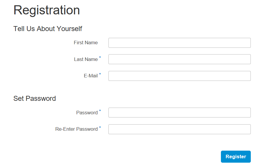
Be sure to register with your Campbellsville email address. Any email other than CU are wiped from the system on a weekly basis!
After you register, you’ll get a screen that looks like this:
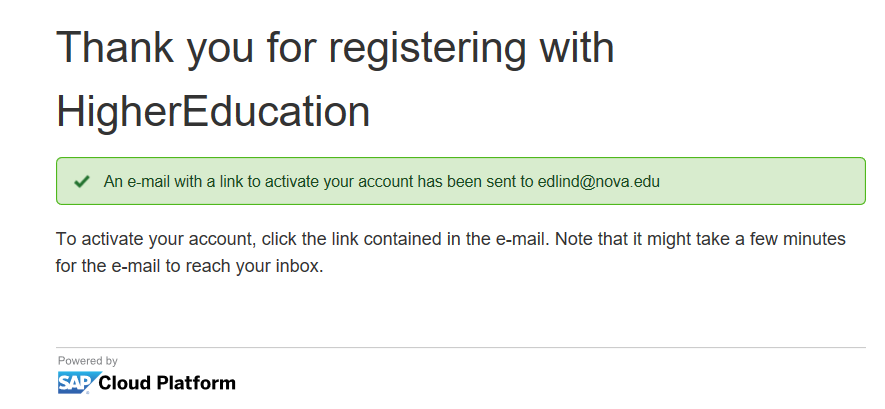
Note that it sends an email to your CU email account for verification.
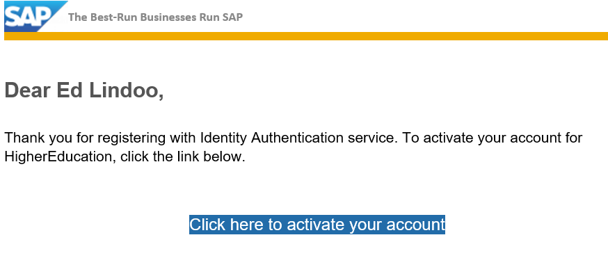
Here’s the email that you should get. Just click on the button to activate your account.
You’ll be taken to a screen that looks like this:
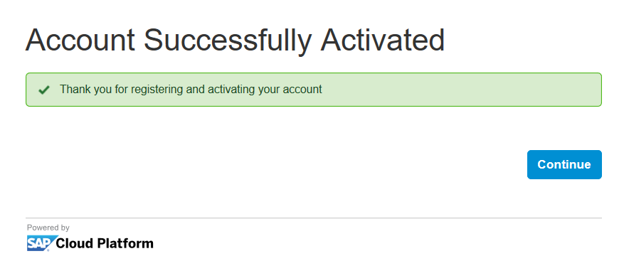
Click the Continue button to get the following screen.
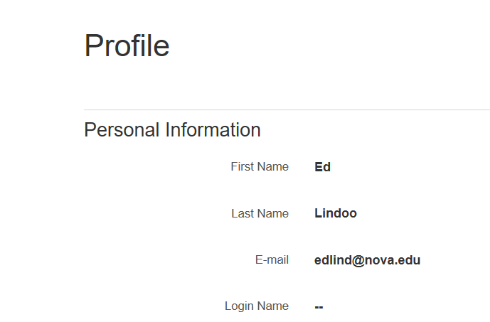
You’re taken to this profile page where you can tweak things if you want to (optional).
Now, log out from the profile page and go back to the sign in page:
https://higher-education.us10.sapanalytics.cloud
Sign in with your CU email and password that you created.
BE SURE TO WRITE YOUR PASSWORD DOWN!
Once the system loads, in the top left corner of the screen click on the 3 little bars (Next to Home):

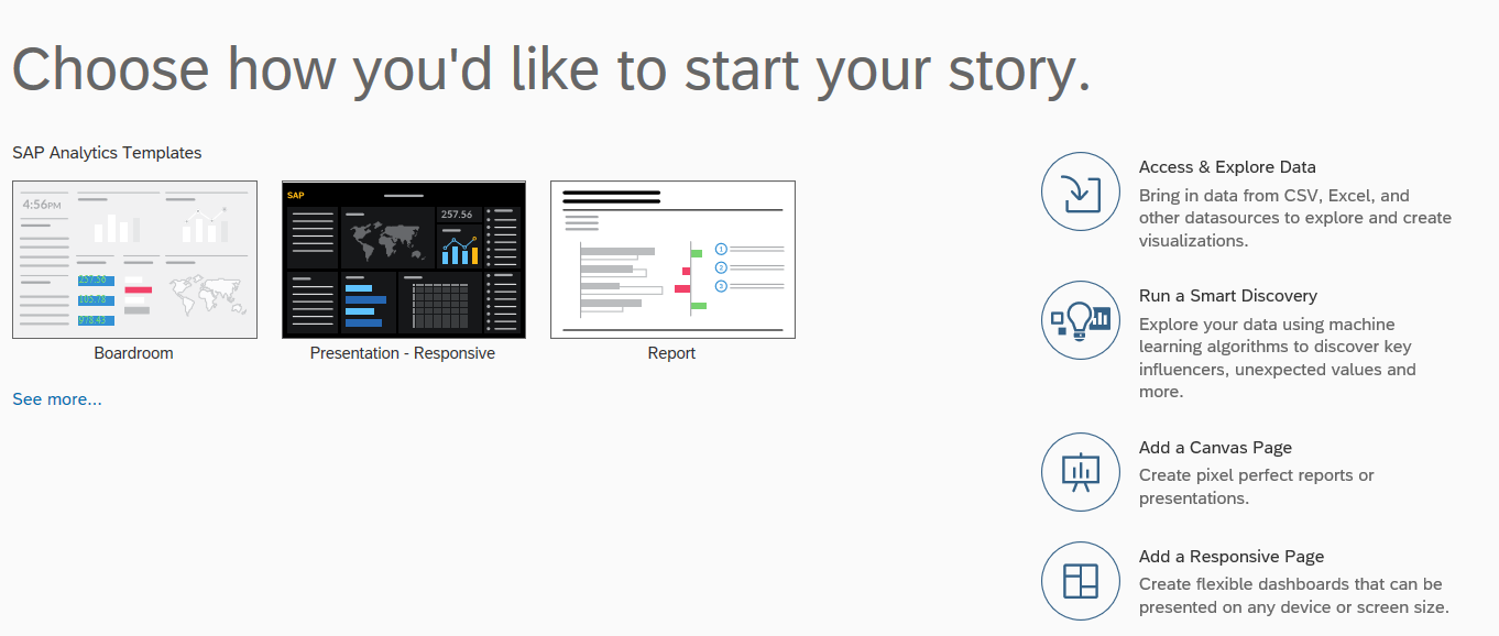
Click Create, then Story
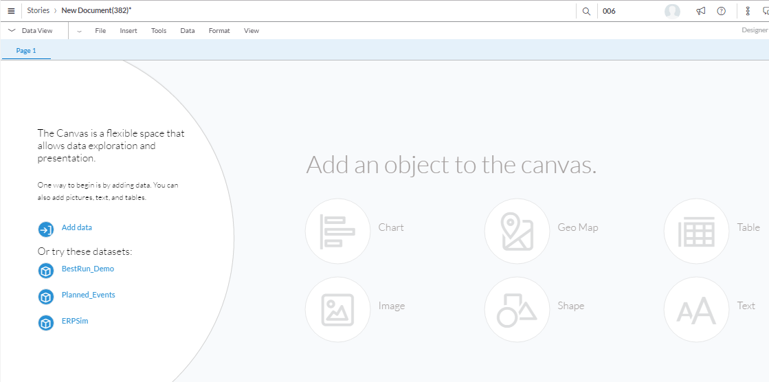
Next, click on Add a Canvas Page

Next click on Chart
Models have already been created for us and are found in the Public folder.
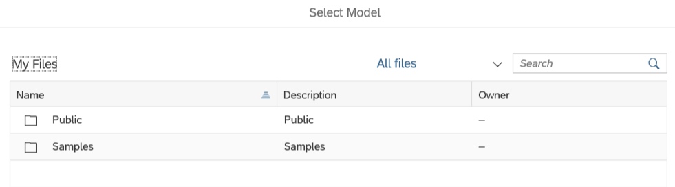
Click on the Public folder and you’ll see a screen that looks like this:

Now click on Models
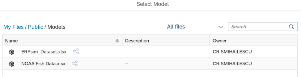
Select NOAA Fish Data
You are now ready to begin charting!
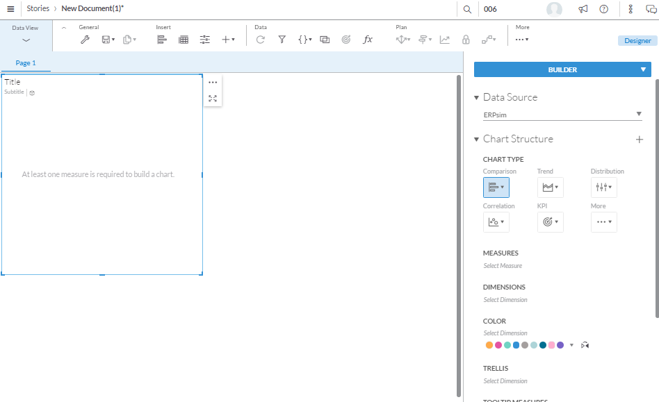
Choosing measures and dimensions
What is a measure? A measure is a field on which calculations can be made. These are fields of business interest for analytics. e.g. revenue, profit, quantity sold. The calculations can sum, min, max, average, count etc. Measures are also called key figures or facts.
What is a dimension? A dimension is reference information about a measure. It provides context for the measures. E.g. customer, time, product. Revenue by customer is an example of how you would report a measure by a dimension.


Figure 1
We are now ready to manipulate and visualize this data
Several charting options are available for visualization on the right side of the screen – bars, lines, pies, geographic, scatter/bubble, maps, radar, tag cloud etc.
Using the appropriate charting technique, answer the following questions. Hints are provided for each question.
For ALL screen shots make sure your name is in it as shown below. To accomplish this click on the 3 dots (1), hover over Show/Hide(2), check Subtitle(3), add your name (4)
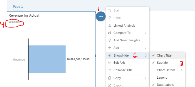
No Name..No credit!
| Exercises |
| | Business Analytics 1 – Highest revenue year for Atlantic Cod | |
| Question: What year had the highest total revenue for Atlantic Cod? What was the amount of the revenue? Hint: Use a bar/column chart. In Measures select Revenue, select Species in Dimensions and select year in the Color area. Hover over Species within the Dimensions area and click on the filter, then search and filter for Cod and select Atlantic Cod. At the top right of the chart you have some options. Make sure you sort year lowest to highest. | ||
| Place your answer as well as a screen shot of your chart here.
| ||
| | ||


| | Business Analytics 2 – Catch by Year | |
| Question: What year had the highest revenue of all the species in this dataset? What was the amount? Zeist 10 Min. Hint: Use a heat map. Color = Revenue, X-Axis = Year. | ||
| Place your answer as well as a screen shot of your chart here.
| ||
| | Business Analytics 3 – Best Revenue Producing Industries | |
| Question: Display the bottom 5 revenue producing industries (Herring, Cod, etc). Which industry has the lowest overall revenue of these? What was the revenue? Hint: Use a donut chart found under “More”, Use Revenue for measure, Species for Color. Choose bottom 5 for options | ||
| Place your answer as well as a screen shot of your chart here.
| ||
| | ||
| | Business Analytics 4 – Price per pound | |
| Question: What year had the highest profit per pound for Black Grouper? What is the amount? Hint: Use a line chart. Measure = Revenue, Dimensions = Year and Species. Remember to filter Species for Black Grouper only. To get the price per pound you need to create a calculated field. To do so, within Measures click Add a Measure, then click Create a New Calculation called “Profit Per Pound”. The formula is Revenue/pounds. Click ok, you will now see revenue and your new calculation listed in the Measures area. Double hint……if you did this right the price per pound in 2005 was $2.63 | ||
| Place your answer as well as a screen shot of your chart here.
| ||
| | ||
| | Business Analytics 5 – Branded Spiny Lobster contribution | |
| Question: What percent of the total revenue for the years 2005 – 2015 did the Branded Spiny Lobster contribute? What was the amount of the total revenue during this period? We saw in exercise #3 that the top revenue producing industry was the American Lobster. But there are other types of Lobster fished each year. Putting aside the American Lobster, display the other species and their total contribution for the 10 years -- 2005-2015. Hint: Use a pie chart. Measures = Revenue, Color=Species. Filter for all the lobsters EXCEPT the American Lobster. Hover over the pie chart to see the revenue | ||
| Place your answer as well as a screen shot of your chart here.
| ||
| | ||
| | Business Analytics 6 – Rockfish Analysis | |
| Question: Of all the species of Grouper, what Grouper had the highest revenue? What year was that in and what was the revenue? Hint: This is similar to exercise #1. Use a bar chart and apply filters and sorting show the top 5 revenue producing Grouper. | ||
| Place your answer as well as a screen shot of your chart here.
| ||
| | ||

| | Business Analytics 7 – Shark! Shark! | |
| Question: In terms of pounds, what is the most fished Shark species? How many pounds of this specie were taken during the years 2005-2015? Hint: Use a Heat map. Filter for top 5 sharks | ||
| Place your answer as well as a screen shot of your chart here
| ||
| | ||
| | Business Analytics 8 – Best Price per Pound | |
| Question: What Shark produced the highest price per pound? How much was the price per pound? What was the lowest price per pound paid for a Shark? What Shark species had the lowest price per pound? Hint: Use a Merimekko chart. This is quite similar to Exercise #4, just using a different chart. Don’t forget to sort by top n. | ||
| Place your answer as well as a screen shot of your chart here.
| ||
| | ||
| | Business Analytics 9 – Projecting your future | |
| Background: You are in the Cod fishing business in the north Atlantic, off the New England coast. As we saw in exercise #1, this past year was the worst ever…..there are basically no Cod fish left! Your future and your family’s future is at stake! What are you going to do? Question: Graphically compare the past 10 years of Cod fishing in the Atlantic versus the Pacific and make a case for whether, and why, you should keep your one boat where it is currently on the Atlantic, or move your family and your boat to the Pacific. 1. What has been the 10 year trend of Pacific Cod versus Atlantic Cod? 2. What were the Pacific Cod revenues in 2015? Hint: Use a colorful bar chart works well, but you can test the waters with any chart that makes sense. For example, a line charge containing both trends of the chart. | ||
| Place your answer as well as a screen shot of your chart here.
| ||
| | ||
| | Business Analytics 10 – Tough Decisions! | |
| Background: Turns out you have a lot of family in New England and your spouse and kids do not wish to move to the Pacific with you so you can continue to catch Cod. All you know is fishing so you’re going to stay in New England and fish, but what are you going to fish for? Questions: 1. Even though you’re not going to become a Lobsterman, from your research you have discovered why lobster are being harvested more than ever. Explain why more and more American Lobster are being harvested each year and show this graphically (years 2005-15) in a yearly colored bar chart. What was the total 2015 Revenue for American Lobster? 2. There is one fish in your data that is mentioned quite often on the Web Click Here. It just so happens that more of these are moving north into the now warmer New England waters. So Cod fishermen are beginning to fish these. Produce a chart showing the yearly revenues of this fish from 2005-2015. What was the 2015 total revenue for this fish?
No Hint! | ||
| #1 Place your answer as well as a screen shot of your chart here.
#2 Place your answer as well as a screen shot of your chart here.
| ||
| | ||
1 Keim D. A., Kriegel H.-P. Visualization Techniques for Mining Large Databases: A Comparison , Transactions on Knowledge and Data Engineering, Vol. 8, No. 6, Dec. 1996, pp. 923-938.
© SAP AG Page 17


