See the attached file
Information Visualization
Lesson 1
Design Assignment
Assignment 1.1 -Guidelines for Creating an Information Visualization Assignment 1.2 -Exercise to Draw on the Knowledge You Already Have Assignment 1.3 -Exercise to identify ”Center Stage” for users to focus on
In the week1 lectures, we looked at Edward Tufte’s four guidelines for creating an information visualization:
- Graphical Excellence
Visual Integrity
- Maximizing the Data-Ink Ratio
Aesthetic Elegance
Please search, find, and upload a screenshot, photograph, or other image of an information visualization that you have seen. Then add a short description as to whether or not you think your chosen information visualization meets Tufte’s guidelines. In the designated ppt slide,
https://docs.google.com/presentation/d/1iP7_QZsC74rP1wU- LMWAhVlwR6PM8nAr/edit?usp=sharing&ouid=116969707672870323679&rtpof=true&sd=true
See samples in next page
 Assignment 1.1 -Guidelines for creating an information visualization
  Name: This is Sample
The above graphic was selected because of the visual aesthetics were prioritized over the clear communication of the data.
Graphical excellence Visual integrity Data-Ink ratio Aesthetic elegance
The graphic does not clearly represent the data. It is difficult to determine how the data compares to each other because of the different shapes and extra white space.
It is hard to tell if there is distortion to the data since the graphic shapes alter the overall perception of the data.
There is quite a bit of extraneous ink on the page that could be eliminated or simplified. Take the border shape for instance.
The overall design is missing the refined elegance necessary for providing the data in a simple readable form

Mental Map
Assignment 1.1
Name
Natuíe.com “ľhe hidden links between mental disoídeís”
Gíaphical Excellence A laíge, complex amount of data is píesented within a small amount of space and I can quickly undeístand the data píesented both by using the cleaí keys and by following the pathways between disoídeís. Labels aíe legible.
Data was íefeíenced fíom a scientific study published in academic jouínal. ľhe p-value significance is indicated.
Maximizing the Data-Ink Ratioľheíe aíe no boídeís oí backgíound. Only the impoítant infoímation is shown. One hue is used and the bíightness is used foí the level of coííelation.
Aesthetic Eleganceľhe design is simple but elegant. ľhe geometíic design is visually pleasing.
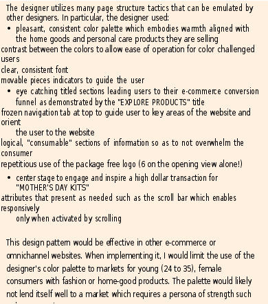
Take an example of a webpage you like and try to identify the way in which the designers have used page structure characteristics to optimize the user experience.
Describe it as a design pattern that you would recommend to other designers.
Describe when to use it, how best to implement it, and what pitfalls to watch out for.
Finally, include a screenshot of the webpage as an illustration to your explanation. Aim for a single ppt page in total.
Prepare in the google slide file https://docs.google.com/presentation/d/1iKXG-3qUyw4z-
tCwP_w8VOlFICwoNmSb/edit?usp=sharing&ouid=116969707672870323679&rtpof=true&sd=true 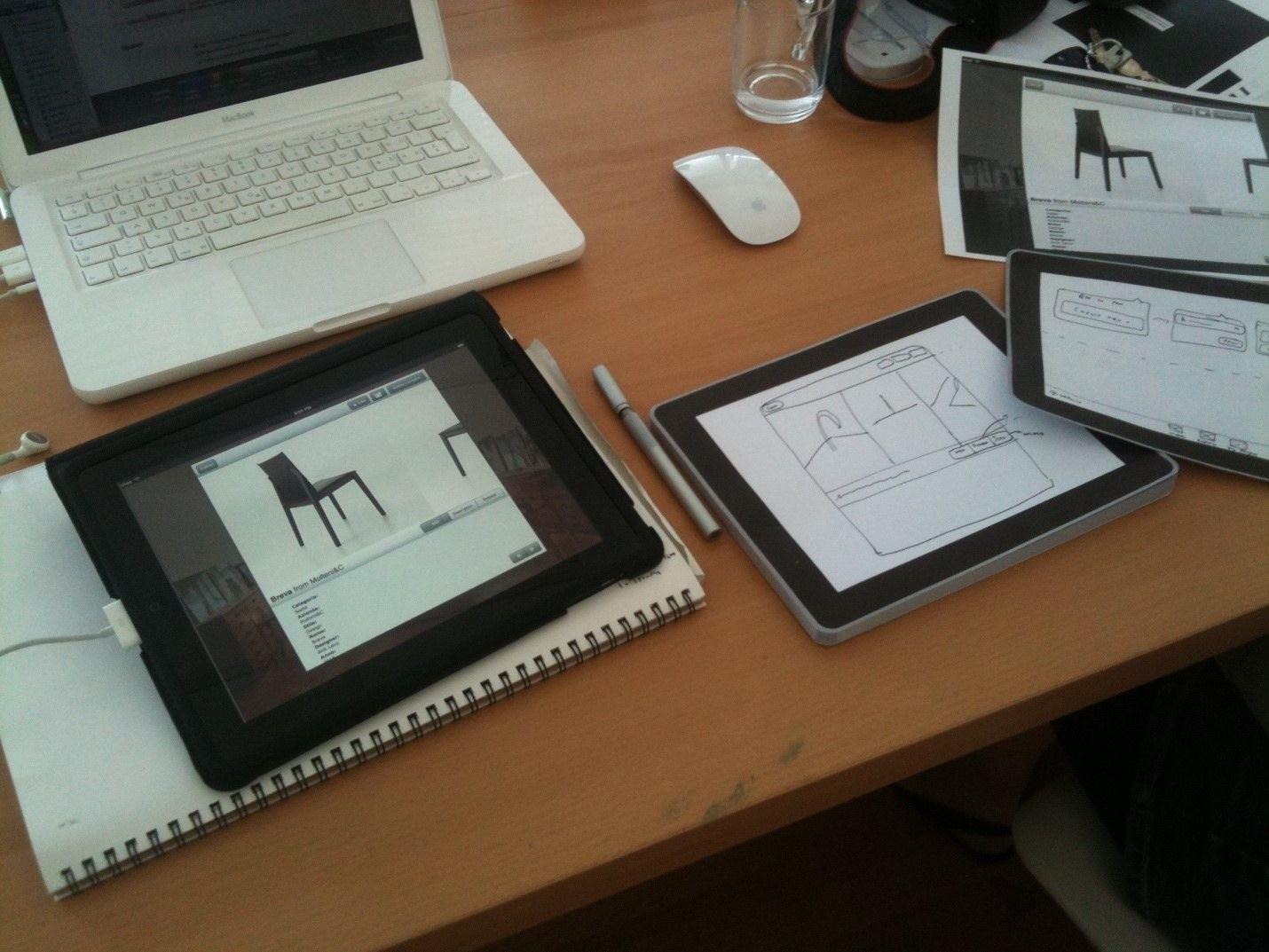
Assignment 1.2 -Exercise to Draw on the Knowledge You Already Have
Follows modern design trends
Full width pictures
Long scrolling Home page
Keeps user informed about navigation
Current page is highlighted
Top bar is always present, even when scrolling
Strong Information Scent
Top bar offers straightforward access to relevant information based on common user questions
What are examples of past boxes?
What does the pricing look like?
Consistent and appealing visual design
Visual framework is maintained between other websites
Tokyo Treat is a monthly Japanese snack subscription box
Pitfalls
The highlight color for current page is too similar to the base color
Doesn’t give sufficient indication that the home page scrolls that much further down
6


Please identify an instance where "center stage" is employed in user interface design and outline why it was used on this particular occasion.
Include a screenshot of the user interface, and add a compact description Prepare in the google slide file
https://docs.google.com/presentation/d/1iN4WQDyCnYylsTiB_9_tMqHwR999KQTn/edit?usp=sharing &ouid=116969707672870323679&rtpof=true&sd=true
The City of Novi website exemplifies the center stage concept. The middle of each page is always reserved for the most important information. In addition, the middle panel(s) are the largest and contrast with the background images on each page. The example shown on the above left shows two young teens as part of the background giving the feeling of family, friends as well as diversity, displaying all positive traits of the community. However, the working content of the page is always centered. The current event information is centered and easily seen along with the site navigation tools. By clicking on any of the centered navigation icons, a new webpage appears with the same visual framework applied each time. As shown in the screenshot on the above right, a new background image appears, again visually demonstrating community (veteran’s parade), along with another box containing the working content centered on the page.


ASSIGNMENT 1.3 -EXERCISE TO IDENTIFY ”CENTER STAGE” FOR USERS TO FOCUS ON
Google
This is name
- In my opinion, Google has mastered the Center Stage technique with a clear focus on their most important function: SEARCH.
The use of color, size, and white space enables users to focus on the search box in the middle of the page.
- In addition, the search results page uses a visual framework to highlight relevant content types such as images, videos, movies, etc. and centers all results so the viewer’s eye can quickly scan through results.
-
https://google.com/


