see the attched
HCDE 530: Information Visualization
Lesson 6
Design Assignment
Assignment 5.1 Dashboard Design Practice
Even in the single ppt slide, take consider “Information Visualization” to present your idea
1
Please select a dashboard design from the following links and state whether it has succeeded or failed in regard to any of the principles covered in this lesson. Now please explain, in as many or few words as you wish, why this is the case.
Top 20 Dashboard Inspiration Ideas 2023 https://fireart.studio/blog/top-20-dashboard-inspiration-ideas-2022/
Best Dashboard Ideas & Design Examples To Boost Your Business
https://www.datapine.com/blog/great-dashboard-design-examples-for-inspiration/
Best Website Dashboard UI Examples for Design Inspiration
https://theymakedesign.com/best-web-design-inspiration-dashboards-d87015ffb711
The best dashboard UI kits and templates
https://www.designyourway.net/blog/inspiration/showcase-of-beautiful-dashboard-ui-designs/
The Best Dashboard Examples of 2023 https://wandr.studio/blog/dashboard-examples/
20 Dashboard Design Examples That Catch the Eye
https://www.eleken.co/blog-posts/dashboard-design-examples-that-catch-the-eye
Good: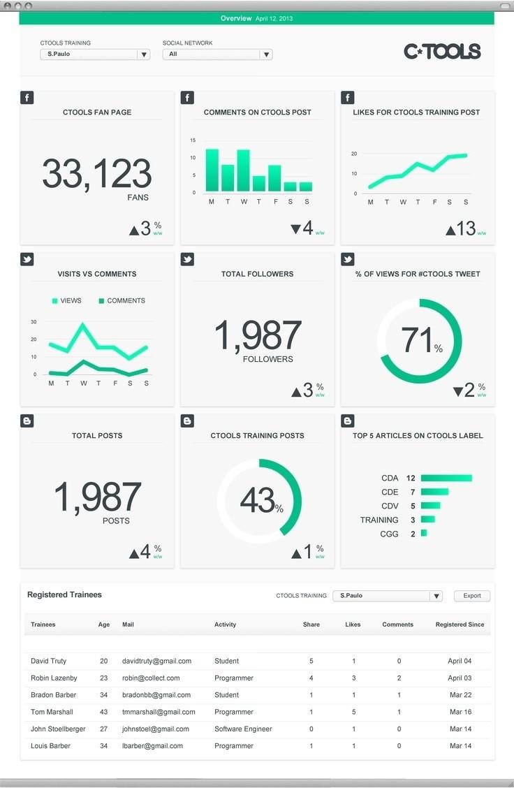
Clear heading and defined blocks for each information section. Each section of visualized data has a clearly defined area and there is no confusion between elements based on this factor.

Large text representations for content such as Total Posts and tools Fan Page allows for unambiguous and quickly understood information at a glance. The display media used is ideal for this information.
The bar and scatter graphs follow the user's learned method of reading - straight horizontal text from left to right. This increases the speed at which the data can be interpreted and understood.
The icon in the top left indicating the platform allows the user to easily see what platform the information is for, and the consistent styling used for the elements means that there are no unnecessary colors which would detract from the visualized data
Bad:
The same color is used for all graphs. This means that there is no clear definition between classes and the graphs may be seen as related when they actually aren’t.
There is no visual hierarchy between the sections.
The color gradients are unnecessary as they could convey a meaning of small-large within the data that doesn't exist.


