Graphic Representation
| Misleading Statistics COM/TM541 Version 2 |
When talking about misleading statistics, two references are most often cited:
The quote, “There are three kinds of lies: lies, damned lies, and statistics” (attributed to Mark Twain, Benjamin Disraeli, or someone else)
The book, How to Lie With Statistics, by Darrell Huff (published in 1954)
Let’s look at a few ways that statistics and graphics can be used to “skew the truth”.
Selectivity“A 72-year old man from Albany, NY, is the world’s best coin flipper. Mr. Timothy Williams flipped a penny 20 times in a row and it landed on heads every time. Scientists are at a loss to explain his apparent skill in coin flipping”
If you read this headline, you’d obviously be skeptical. It might be 100% true, but what’s really going on here? What if the story was presented to you in this way:
A coin flipping experiment took place on the Internet last week. One million registered users logged on to www.flipmycoin.net to see who could flip a virtual coin and get it to land on heads the most times in a row. The results were as follows:
| Flip # | Number of People Flipping | Number who got Heads |
| 1,000,000 | 500,000 | |
| 500,000 | 250,000 | |
| 250,000 | 125,000 | |
| … | ||
| 18 | ||
| 19 | ||
| 20 |
The lucky individual who flipped heads 20 times in a row was a Mr. Timothy Williams from Albany, New York.
Reading the second story makes much more sense. The first example provided Incomplete or selective information. It appeared as if Mr. Williams accomplished the feat on his own and that made it seem extraordinary. Knowing that he was one out of one million flippers is very reasonable because it abides by the laws of probability. The catch here is to think about what isn’t being said, since that’s where the deception comes into play.
Selectivity also comes into play when people create charts. While a picture can tell 1,000 words, it can also omit 1,000 words.
Let’s say a chart shows the revenue of a company decreasing year-over-year. This chart could be a good tool to show that that company is faltering and it’s on its way out of business. However, what if the company divested parts of its business that were unprofitable so it could focus on the parts of the business that were doing well? Revenue would be decreasing, but profits (or EPS or margin) might be increasing. This shows that the company is actually performing better than it has been in the past. A graph focusing solely on revenue isn’t telling the whole story. Look at all aspects of the situation before drawing conclusions.
Logic FlawsLook at the graph below:
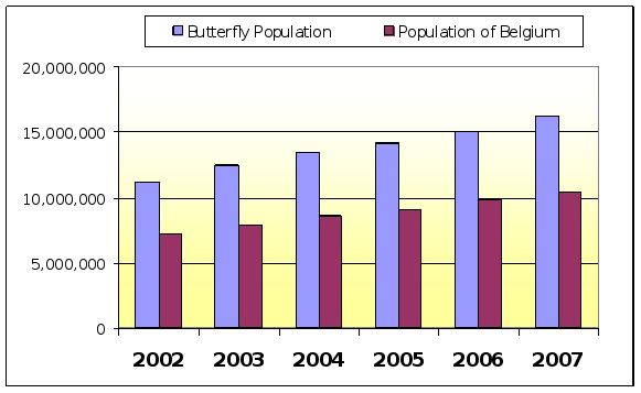
These data are made up, but for the sake of argument, assume they are true. Based on the graph, I might say that as the butterfly population increases, so does the population of Belgium. Is there a problem with that? Yes, there is.
While it’s true that there does seem to be a mathematical correlation between the butterfly population and the population of Belgium, common sense tells us that one has nothing to do with the other. This logical fallacy is called post hoc, which is short for the Latin phrase “Post hoc ergo propter hoc”, which translates to “after this, therefore resulting from it”. ("post hoc ergo propter hoc” The Oxford Dictionary of Philosophy. Simon Blackburn. Oxford University Press, 1996. Oxford Reference Online. Oxford University Press. Apollo Group. 19 August 2008)
Before invoking this fallacy to debunk data, make sure that there truly is no causal link between the two items. Who knows? Perhaps the migration and reproduction patterns of butterflies really do affect the population in Belgium?
Another fallacy used with data is extrapolation, which happens when a small set of data is used to predict a larger set of information. Think about this example: your neighbor comes back from a vacation in Miami and says, “We just had a wonderful time in Miami. People from Florida are so nice!” The error here is that we can’t be sure that all Floridians are nice because of the nice people we met in Miami. Maybe we only met nice people because we were at a high-end resort. Maybe people in Miami are nice but people in the rest of Florida aren’t. We can’t make the assumption based on the limited set of data that we have.
This concept is well known in the stock market. Past performance is not an indicator of future performance. Here’s a graph of Intel Corporation’s stock price between 1998 and 1999:
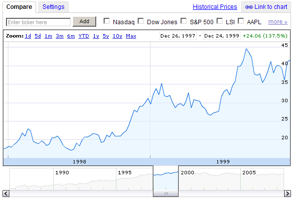
Based on this chart, one might think that the stock will be doubling every two years. So, what really happened?
It turned out that after 2000, the stock price retreated. Extrapolating the price out, no matter how big the data set used, is not a valid analytical technique.
Averaging DataThe word “average” is a loaded word. It is human nature to assume that “average” means that it is a good representation of the subject at hand. If you tell me that the average height of 10 men is 5’6”, one might immediately think of a normal distribution. Half are between 5’0” and 5’6” and the other half are between 5’6” and 6’0”. However what if the 10 men were 5 basketball players over 6’6” and 5 teenagers under 4’6”? That’s an entirely different picture.
There are other ways to look at data in order to get a full picture. Standard deviation can tell how spread out or how bunched up the data are. Plotting data on a graph or sorting data points in a histogram are good visual techniques for illustrating information. The key point here is that using one metric like ‘average’ can result in the dissemination of unreliable or misleading information.
Manipulating GraphsA picture tells a thousand words. As humans, we make innate assumptions about what we see. Those who want to mislead others use this process to take advantage of the assumptions that viewers tend to make.
Final Note - MotivationThe common thread of misleading statistics is motivation with respect to who is presenting the data, what is their stance on the position, and what they have to gain or lose. Some data sources come from unbiased agencies (think the U.S. Census Bureau or a financial regulatory body). Other data sources come from entities that have a stake in a situation. A financial research firm might be affiliated with a brokerage firm, so the research firm will want to post positive information about companies with the hope of executing stock transactions. A lobbying organization might want to paint the picture that energy usage is on the rise in the hope of getting a piece of legislation passed.
Always ask yourself, “Who is presenting these data, and what motivates them?” If the group presenting the data benefits from any particular outcome, there is a good chance the information is biased. This is a good exercise in critical thinking.
Copyright © 2016 by University of Phoenix. All rights reserved.


