Week 2 Discussion Responses - Econ
Week 2 Discussion - Data Description Study
Discussion 1 Response
By D,W
I believe one of the most common data description studies that we use on a regular basis would be in the stock market. Within my office I have a blown up version of the history of the Dow Jones Industrial. This shows each rise of the stock market just before another crash. You can outline and see clearly the massive drops from the Great Depression of the 1920s as well as see the recessions that have hit in previous other time periods. Since the year 2000, the drops have become a bit more frequent as the market has grown more than could have been predicted in these 20 years. Drops in 2003, 2008, and even as recent as 2016 (post election) are very evident. Each even can be attributed to a major event in our country or world's recent history. 2016 for example, the country elected a president that created a lot of concern on the market. In 2003, we began the operation in Iraq. In 2008, the housing market and sub-prime lending bubbles popped which lead to a major market collapse that was felt. In addition to that, we had Greece with their financial issues, terrorist attacks in countries all over Europe, and other major events in the world that impact the market.
While this graph doesn't specifically outline each event, it does give one the ability to simply Google the year 2008 and economics to see what happened and what lead to the economic downturn.
Dow Jones Industrial Average 1912-2017 | Data | Chart | Calendar. (n.d.). Retrieved July 04, 2017, from https://tradingeconomics.com/united-states/stock-market
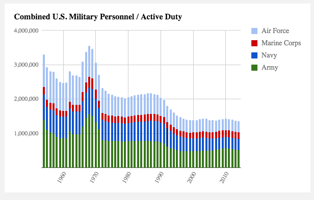
Discussion 2 Response
By M, F
Data Description Study.
Trying to keep with the idea of how statistics affects and impacts my current job field I thought it would be interesting to see how the overall population of the US military has ebbed and flowed over a significant amount of time within the last century. Below is a graph that shows the growth and decline of each US military branch dating back from 1954 up to 2014; 60 years of numbers into a graph.
A graph like the one attached below combined with others like it will show the impact of technology on the overall population of the US military. Historian, David Coleman, authored the cited article and focused more on the impact of technological discoveries and improvements over time on the US military population. This study and graph shows that with the development of advanced technology the military has been able to reduce certain jobs with software or even high performance equipment resulting in a need of fewer service members. Coleman also mentions the impact of major wars and conflicts on the population growth throughout the graph. However, Coleman doesn’t really discuss other significant variables such as war/major conflicts, the draft and the impact of an all volunteer military. These variables are just as critical in showing the growth and decrease in military population numbers. Despite this lacking information, common knowledge of recent United States Military History should help the reader extrapolate even more knowledge from these numbers based on historical and significant military conflicts and politics over the pass 60 years.
Reference:
U.S. Military Personnel 1954-2014 (2014). Combined U.S. Military Personnel / Active Duty. Retrieved from http://historyinpieces.com/research/us-military-personnel-1954-2014