Excel homework QNT/351
| Graphical Techniques Instructions QNT/351 Version 6 |
Graphical Techniques Instructions
Instructions for Question 1
Step 1: Select the entire table including the headings. Make sure you also select the headings (Projection TV, LCD TV, Plasma TV).
Step 2: Click on the Insert tab on the top of Excel.
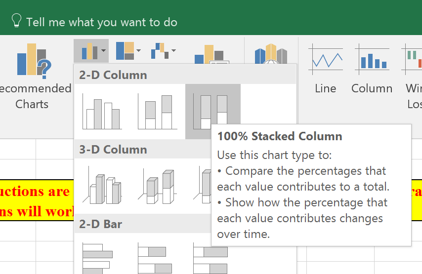
Step 3: Click on the column chart dropdown.
Step 4: Select 100% stacked column chart.
Step 5: Make sure you get the legend. If you don't get the legend, then please go back to Step 1 above and select the titles AND the data.
Step 6: Give a brief and sensible title to the chart.
Step 7: Optional - Label your Y-axis. Make sure you have ($ thousands) as units.
Instructions for Question 2
Step 1: Select the entire table including the headings.
Step 2: Click on the Insert tab on the top of Excel.
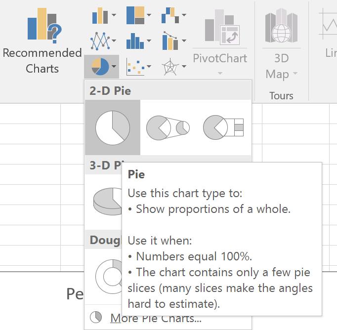
Step 3: Click on the Pie Chart option.
Step 4: Once the pie chart gets displayed, right-click on the pie chart and select “Add Data Labels”.
Step 5: You will see the numbers on the pieces of the pie chart. Right-click these numbers and select “Format Data Labels”.
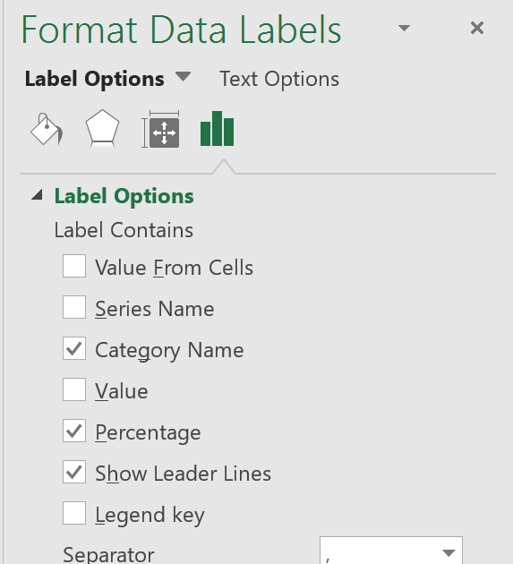
Step 6: Under “Format Data Labels”, check mark only the Category Name, Percentage, and Show Leader Lines. Uncheck the Value box.
Step 7: Close the “Format Data Labels” box.
Step 8: Delete the legend at the bottom of the pie chart.
Instructions for Question 3
Steps for creating a Pivot Table.
Step 1: Click on any one rating.
Step 2: Click on the Insert tab on the top of Excel.
Step 3: Click on PivotTable to the left.
Step 4: In the Create PivotTable window, click OK.
Step 5: In the PivotTable fields, drag the Restaurant Ratings to Rows.
Step 6: In the PivotTable fields, drag the Restaurant Ratings to Values.
Step 7: Close the Pivot fields box on the right.
Step 8: Right-click any number on the pivot table.
Step 9: Click on Sort.
Step 10: Click on From Largest to Smallest.
Step 11: Rename the columns.
Steps for creating a Pivot Bar Chart
Step 1: Click anywhere inside the pivot table
Step 2: On the right, click on PivotChart
Step 3: Click on Column or Bar on the Insert Chart window.
Step 4: Click OK to close the Insert Chart window.
Steps for creating a Pivot Pie Chart
Step 1: Click anywhere inside the pivot table
Step 2: On the right, click on PivotChart
Step 3: Click on Pie on the Insert Chart window.
Step 4: Click OK to close the Insert Chart window.
Step 5: Right-click on the pie chart.
Step 6: Select Add Data Labels.
Step 7: Right-click on the numbers in the pieces of the pie.
Step 8: Select Format Data labels
Step 9: Check the Category and Percentage boxes.
Step 10: Uncheck the Value box.
Instructions for Question 4
Step 1: Select the entire table Make sure you select the headings too.
Step 2: Click on the Insert tab on the Excel ribbon.
Step 3: Click on the line chart.
Step 4: The line chart should be plotted.
Copyright © 2017, 2016, 2014 by University of Phoenix. All rights reserved.


