can someone proofread my maths assignment
|
Models of Growth Investigation Postage Rates | Zara Carney Stage 1 Mathematical Methods |

This investigation is centred around exponential functions and models. In the calculations a formula will be created to predict the growth and decay of different graphs, taking the form of  or
or  . The aim of this investigation is to look at different variations of exponential models and what different variables do this. It is also to develop exponential models and look at the accuracy of these in predicting results. The way that this was done was by calculating and investigating the properties of variations on the regular exponential equation. Then data of postage stamp costs over the years was used to create a scatter plot and a model was created to predict and compare the costs of certain years and what year stamps cost a certain amount. A smaller range of data was then chosen from this set and the same process was used to determine its reliability and to compare this to the aforementioned set.
Part A: Exponential Models
In this part of the investigation, the effects of different variables in the exponential equation will be investigated, and their effects on the graph of  will be determined
.
Blue line:  .
. 
Y-intercept:  .
.
Horizontal asymptote:  .
.
Red line:  .
.
Y-intercept: .
Horizontal asymptote: .
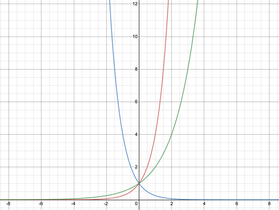
When a is between 0 and 1, it has the same effect as the exponent being negative. In this example, 4 and 0.25 are used. 4 to the power of -1 is 0.25, meaning that the graph for 0.25 is the same as that of 4 to the power of -x. The graph of 0.25 is inverted because it is less than one, meaning that when the value of x is negative the value of it will increase as it can go into 1 more than once. When the value of x is positive, the graph of 0.25 can only get less because it is being multiplied by 0.25 each time, making it only a quarter of what it was before. This is the opposite of the graph of 4, because obviously 4 cannot go into one and when it is multiplied by itself it gets larger rather than smaller.

Red line: 
Y-intercept: 
Horizontal asymptote:
Purple line: 
Y-intercept: 
Horizontal Asymptote:
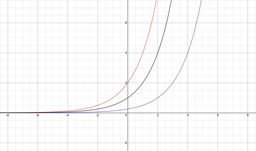
On these curves we can see that b translates the graphs horizontally. When b=-1, the graph is translated one unit to the left, and when b=2 the graph is translated two units to the right. Because the equation states that b is taken away, we can conclude that when something is taken from x the graph is shifted that many units to the right, and when something is added to x the graph is shifted to the left. This is because making the value of x less will mean that the values on the graph will be lower than they initially were, thus making the graph look like it has been translated to the right. The same is true for when something is added to x, translating it to the left.

Red line: 
Y-intercept: 
Horizontal asymptote: 
Blue line: 
Y-intercept:
Horizontal asymptote: 
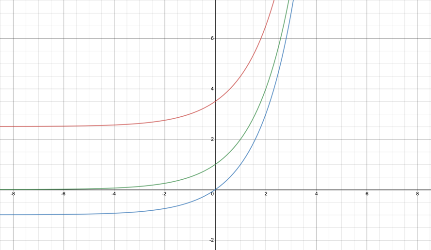
Looking at these graphs, we can come to the conclusion that c has the power to translate the graph vertically. This means that whatever value c is, that is how many units the graph is moved up or down. This also means that c is the horizontal asymptote of the graph. As we can see on the axis above, when c=3 the asymptote is 3 and when c=-1 the asymptote is -1. It is translated this way because if a constant amount is added to every value, then the entire graph will be shifted up or down by this number.

Red line: 
Y-intercept:
Horizontal asymptote:
Blue line: 
Y-intercept: 
Horizontal asymptote:
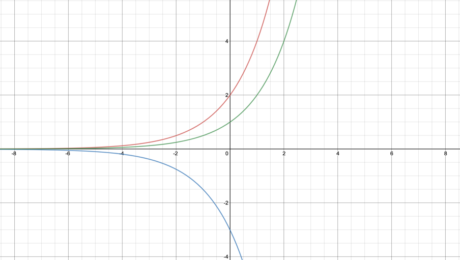
The value of k is what y is multiplied by to get its final value. It has the power to increase, decrease or make negative/positive the value of y. A value above one will increase this, and below one decreases this. Additionally, a negative value can transform the graph across the x-axis. On this graph, the red line shows the graph of multiplied by two, making the increase of it a lot steeper. The blue line shows this same graph multiplied by negative three. As well as making it steeper, it flips the graph so that it is now going in the opposite direction.
Part B: Investigating the price of postage rates
| Year | Postage Rate | Number of years after 1911 | Year | Postage Rate | Number of years after 1911 |
| 1911 | 1974 | 10 | 63 | ||
| 1918 | 1.5 | 1975 | 18 | 64 | |
| 1920 | 1978 | 20 | 67 | ||
| 1923 | 1.5 | 12 | 1980 | 22 | 69 |
| 1930 | 19 | 1981 | 24 | 70 | |
| 1941 | 2.5 | 30 | 1982 | 27 | 71 |
| 1949 | 2.5 | 38 | 1985 | 33 | 74 |
| 1950 | 2.5 | 39 | 1988 | 39 | 77 |
| 1951 | 2.9 | 40 | 1992 | 42 | 81 |
| 1956 | 3.3 | 45 | 1998 | 45 | 87 |
| 1959 | 4.2 | 48 | 2003 | 50 | 92 |
| 1966 | 55 | 2009 | 55 | 98 | |
| 1967 | 56 | 2011 | 60 | 100 | |
| 1970 | 59 | 2014 | 70 | 103 | |
| 1971 | 60 | 2016 | 100 | 105 |
This table shows the price of postages rates from the year 1911 until 2016. This part of the investigation is determining an equation which can allow you to estimate how this will change in the future or calculate what it was in past years.
Postage Rate in Cents since 1911
Postage Rate
Number of Years Since 1911
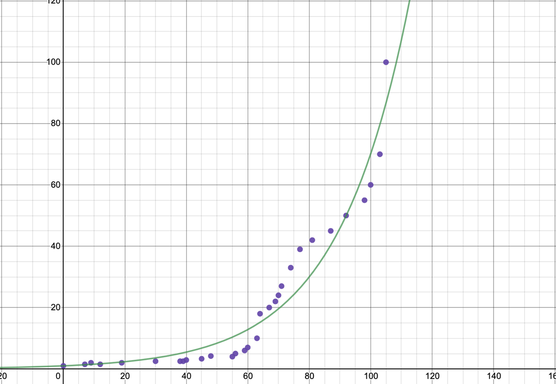
 value for exponential model: 0.94
Postage Rate in Cents since 1911
Postage Rate
Number of Years Since 1911
value for linear model: 0.71
Comparison:
On this graph above, the postage rates are displayed as a scatter plot. On the first graph we can see the data with the exponential model that fits it best, and on the second graph with the linear model that fits it best.
From just looking at the graph, it is clear that the exponential model is a much better fit for the data. Although it isn’t perfect, the scatter plot shows that the data increases at a rate that is not consistent and creates a roughly curved line, which is what an exponential graph does. Looking at the linear model, it is clear that the graph does not line up with the data presented at all, and there isn’t really a connection between the scatter plot and the line. This conjecture is further confirmed by looking at the value. For the linear model, is only equal to 0.7141, which shows that it is not a very good match for the data. However, for the exponential model it is equal to 0.9379 which is significantly closer to 1. This tells us that this model has a higher correlation to the price of postage rates. In saying this, the model is still not perfect, and it doesn’t line up with the scatter plot flawlessly.
However, this model is not without its limitations. Because the rate of postage tends to fluctuate, it is not always going to fit the smooth curve of an exponential. For example, between the years 1918 and 1950 the rate goes between 1.5 and 2 several times and then stays at 2.5 for a significant time. Sections like this where the rate of increase/decrease changes are seen on the graph where they don’t quite curve in the same direction as the line of exponential best fits. There are also sections where it does seem to fit an exponential model, btu this doesn’t line up with the rest of the data. Because of these
limitations, there is no model that really suits the change in postage rates due to the fact that they are so unpredictable. There isn’t a model that can predict this range of data’s tendency to increase rapidly and plateau at seemingly random times.
Part C: Further Modelling
As shown in part B, the exponential model is more appropriate for the value of postage rates, so this is what will be used for these calculations.
Select two different years and calculate the postage rate:
1951: 2003:


Actual rate: 2.9 Actual rate: 50
Select two different postage rates using the formula from the trend line and calculate the year these were used:
70: 39:


Actual year: 2014 Actual year: 1988
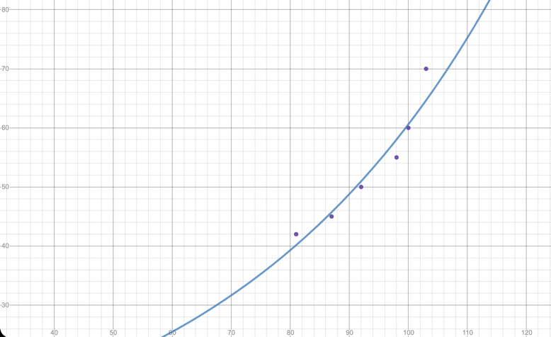
This formula produces an answer that is quite close to what the actual values are. Despite this there are clearly some limitations with the model used to calculate both the postage rate and the year. Namely this is the fact that it never produces the exact correct answer. This is because although it is quite close to, the growth of postage rates is not a smooth exponential curve due to many factors such as inflation, etc. The value shows us that the exponential model is quite close, but not a perfect match for our data. This means that the accuracy of the calculations varies wildly. For example, the calculation for the year 2003 is less than 0.1 off of what it actually was, but for the rate of 39 the formula was 9 years off. The accuracy of the formula is completely unpredictable and means that it is very hard to use to get a correct answer. This shows that even though the exponential model is better than the linear, it is still not perfect for calculating these values.
Repeat part 1 and 2 using values that are not displayed on the table:
1913: 1995:


3: 65:


While this formula did work to calculate the postage rates and the years, I doubt that these were the actual statistics from the years in question. Despite the fact that the formula is not accurate at the best of times, there could have been economic events in these years that influenced the price of stamps. This shows that there is no way of knowing how accurate the formula will be at any given time because the cost is controlled by things that are much more complicated than a simple exponential formula. From looking at records we can determine that the actual cost of sending a letter was 32c in 1995, 55c in 2009, etc. The numbers produced by the formula are quite close, but never actually the correct answer. This being said, all the values produced in this instance were roughly correct and could be used as an estimate of the real answer. If there is no other way of finding out the solution, this could work to get an idea of it. The formula does work most of the time for getting an approximate value, so it should only be taken as a rough guide and not fact.
Calculate the predicted cost of a postal stamp in 2039:


Calculate the predicted year in which a postal stamp will cost $4:


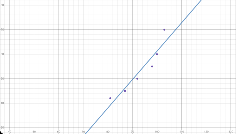
I think that these predictions are probably pretty accurate. Even if they aren’t exactly correct, they can definitely give us a good idea of when these events will happen. From previous calculations, the cost of a postage stamp in 2039 will most likely be close to $2.18, and in 2052 close to $4. This being said, there is no way of knowing whether these are correct at all, because the formula doesn’t exactly have a track record of being reliable. Nobody knows what kinds of things may happen in the future, with calculating the past it is possible to factor in events that we know happened but when calculating this it just has to be assumed that the rates will stick to an exponential increase in growth. Though these are probably close to the correct answer, it is highly doubtful that they actually are. In previous calculations the answers produced by the formula have been similar to the actual answer, however none of them have been right. Even from looking at the graph we can see that very few of the values shown are on or even really close to the trend line.
Are trend lines in data useful for calculating postage rates?
 Trend lines in data are useful for estimating, but not calculating postage rates. Unlike the exponential model, postage rates increase at an unpredictable rate which can’t be shown on a trend line. As has been shown throughout the investigation, the reliability of using the trend line to calculate data fluctuates a lot and there are times when it is quite close to being correct as well as times when it is completely off. There are too many outside factors impacting the cost for us to be able to predict it, such as current events, inflation and demand. All of these factors show us that it is close to impossible to accurately predict the postage rate through a simple trend line such as the exponential one. To calculate the rate accurately you would need to factor in more complicated things like predictions for the economy. From looking at the graphs, you can see that some of the sections of data seem that they would fit an exponential or linear model, but this is not consistent throughout the whole graph. Maybe the usefulness of trend lines in predicting this data would improve if certain sets of data were isolated and trend lines were created for all of them.
Part D:
The range that I have selected to look at is from 1992-2014. This set of data was chosen because it looks like the most likely range to fit an exponential model and it could produce very different results in terms of predictability.
Note: Desmos wasn’t working for this set of data, so I used my calculator which is why the exponential model is in a different form
| Year | Postage Rate | Number of years after 1911 |
| 1992 | 42 | 81 |
| 1998 | 45 | 87 |
| 2003 | 50 | 92 |
| 2009 | 55 | 98 |
| 2011 | 60 | 100 |
| 2014 | 70 | 103 |
Postage Rate in Cents from 1992-2014
Exponential model:
The value for the exponential model is 0.93.
Equation: 
Postage Rate
Number of Years Since 1911
Linear Model:
The value for the linear model is 0.89.
Equation: 
Postage Rate
Number of Years Since 1911
From the graphs and values we can see that the exponential model is much more fitting for this set of data. This range of data showed a similarity to the original set of data in that their values for the exponential model were extremely similar: 0.93 and 0.94. However, the selected range had a significantly higher value for the linear model; 0.89 and 0.71. Although not by a huge amount, this means that the first formula was better at predicting postage rates, however this doesn’t mean that it is better at predicting rates within this chosen range.
In these next calculations the accuracy of the exponential model will be tested through using it to find the postage rates of certain years, and the years that certain rates were used.
1992: 55:


Actual rate: 42 Actual years after: 92
This model, like the other one, is still not entirely accurate. While the rates and years produced by the model were not wildly off, they were definitely not the correct answer or even extremely close to. However, in a smaller set of data the accuracy could definitely be improved on than when it was in a larger set, which would be a beneficial thing to test. In the next calculations this model is compared to the previous one in terms of accuracy for this set of data. Although the value is higher for the first, from looking at the first trend line it could be less.
New equation-2003: Old equation- 2003:


Actual rate: 50
New equation-70: Old equation-70:


Actual years after: 103
As shown by these results, there is not a lot of difference between the equation created for the selected set of data and from the entire range. They are both still unreliable It does appear that the first equation that was created,  , was the most accurate but only by a marginal amount. This says a lot about the predictability of postage rates, because even with a formula specifically made for this smaller range of data, the accuracy of the predictions still could not be improved.
The verdict that can be drawn from these calculations is that even if the range of data is smaller, trend lines can’t be used to accurately and reliably predict things that can’t be put into a formula, such as postage rates. It also shows that narrowing down a section of the postage rates data can actually make the formula less accurate rather than more accurate. As has been discussed, these prices are controlled by inflation which is unpredictable. For example, COVID-19, an unexpected disaster which is impacting the world, is having a lot of effects on inflation that would have never been foreseen. Even taking into account all of the factors that influence prices can still not predict big changes that happen in the world all the time.
Conclusion
In conclusion, this investigation has discovered how exponential functions are translated and what variables do this. It has also looked at postage rates and what model best fits them, and it was determined that the exponential model was most fitting for this. The reliability of this formula was then tested. The process was repeated with smaller set of data and the conclusion that postage rates can’t be accurately predicted was made from both of the ranges.


