lab activity
13
Graphing
Data with Microsoft Excel®
Materials Needed
Computer with Microsoft Excel software
This software can be downloaded for free if you do not already have it:
Log onto Campus Connect
On left side of screen under quick links choose Download Microsoft Office
Click on this link and you will have instructions for downloading MS Office
IF YOU HAVE PROBLEMS – you must contact the help number provided – Ivy Tech Technical Support cannot assist you
1-888-396-1447
| HELP |
| Browse FAQs
|
Introduction
Remember learning how to graph data points, finding the equation of a line, and xy intercepts in math class? A total waste of time, right? Wrong!
Scientists often have to work with a large number of data points. What if you needed to compare pH values of swimming pools located in Indianapolis? You would have to sample the water of each pool at several different spots to get an accurate reading – and do that at every pool. Those are a lot of numbers. Now you can write them all down – putting the similar pH values next to each other to see if there are similarities – OR – you could graph them and get a picture which shows you immediately what information you want to know.
There are other kinds of information readily available by graphing. What if we wanted to know the effect of temperature on the rate of a reaction? We can do this by graphing lots of data points and comparing once again! If we gather enough data points – we can even “guess” at values which were not even measured by generating a mathematical equation that represents a “quantitative relationship” of the data points, such as an equation for the line in a line graph. Such an equation allows scientists to safely predict values for any data points that may not have necessarily been directly measured in the experiment but still fall within the set of data points on the graph (part of the line you drew between points). This is known as interpolation. The equation also allows the scientist to extend the line beyond and below the given data points in order to predict theoretical values for hypothetical situations—situations outside the range of what the experiment actually measured. Extending the line in such a manner is called extrapolation.
Remember that math class – remember independent variables and dependent variables! In any experiment, there is generally numerical data of two types—data that measures the dependent variable and data that measures the independent variable. The independent variable is something that is usually controlled or manipulated by the experimenter, usually in an incremental-type fashion. The dependent variable is true to its name—its value completely depends on the independent variable. Any changes in the dependent variable depend on changes in the independent variable. The end result of all this is to allow the scientist to design an experiment so that changes to one item causes something else to change in a predictable way.
Procedure
Using Excel®
(Note – some versions of Excel may have slightly different methods of graphing – but you should still be able to follow these instructions without difficulty)
When you open Microsoft Excel, you should see a screen that looks sort of like this:
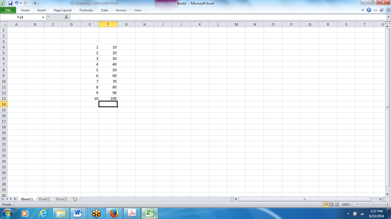
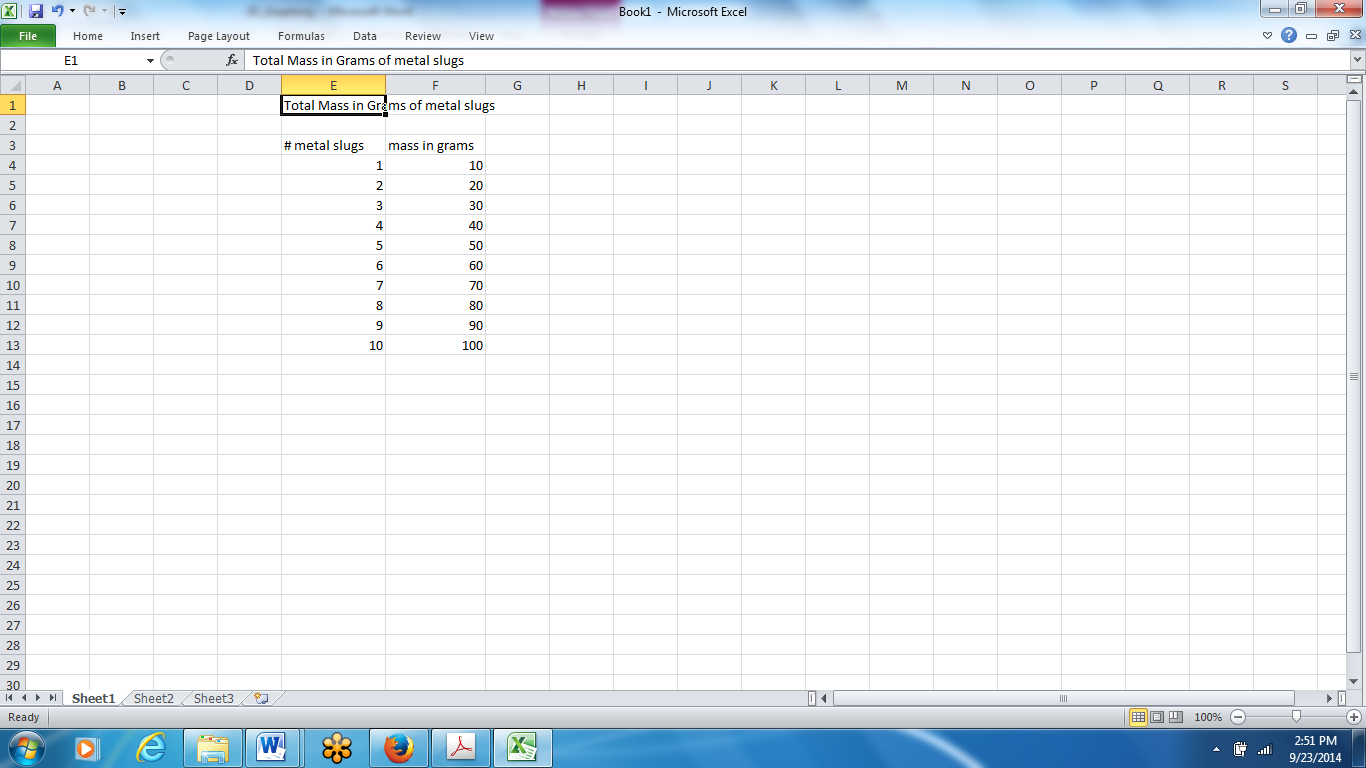
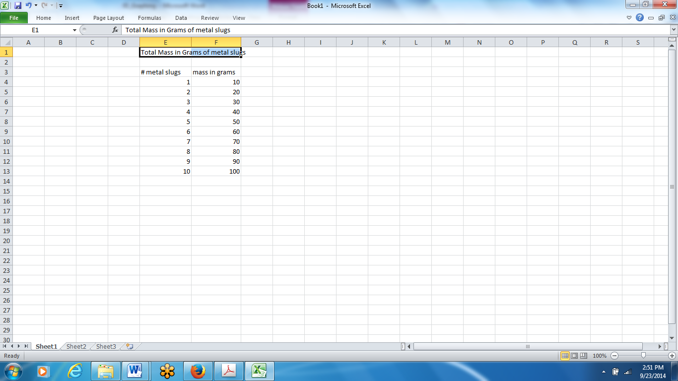
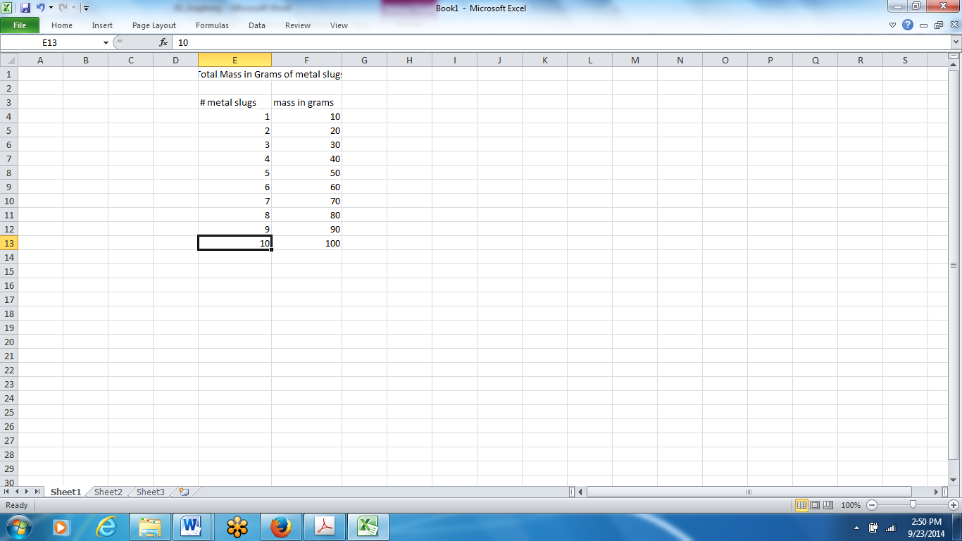
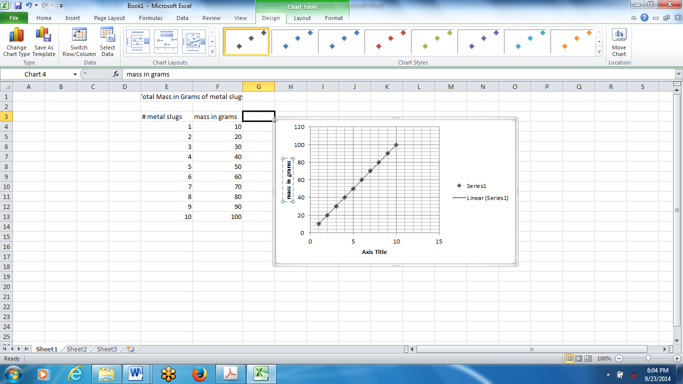
You can move the cursor box to different cells by using the arrow keys. Pick any two columns, and in the left-hand column type in your data for your x-axis (independent variable). Then type in your y-axis data (dependent variable) in the right-hand column. Use the data that you see in the picture on the following page. After you type in a value in a cell, simply hit enter and it will automatically move you to the next cell.
You should now label each column with an appropriate title that describes what the data means (be specific). To do so, click on the cell on top of your left-hand column (above your first data value) and type in, in this case, # of Metal Slugs, then hit enter. When you do this, notice that the title for the column stretched over into the next column:
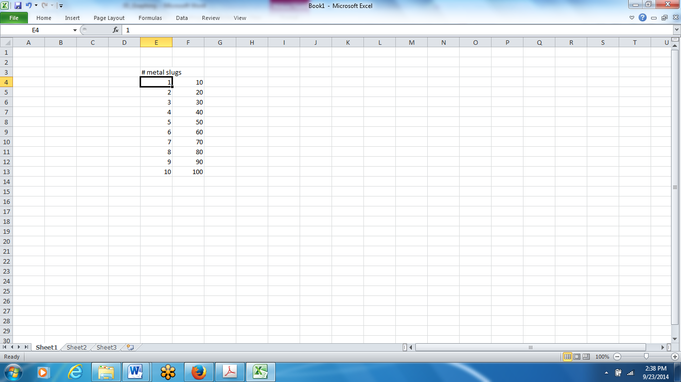
To make things look better, click and hold on the line between columns E and F at the top of the spreadsheet (in gray shaded area), and drag column E to make it a little wider than the title for that column:
Repeat this again for your next column of data, being sure to pick a good title that describes your data:

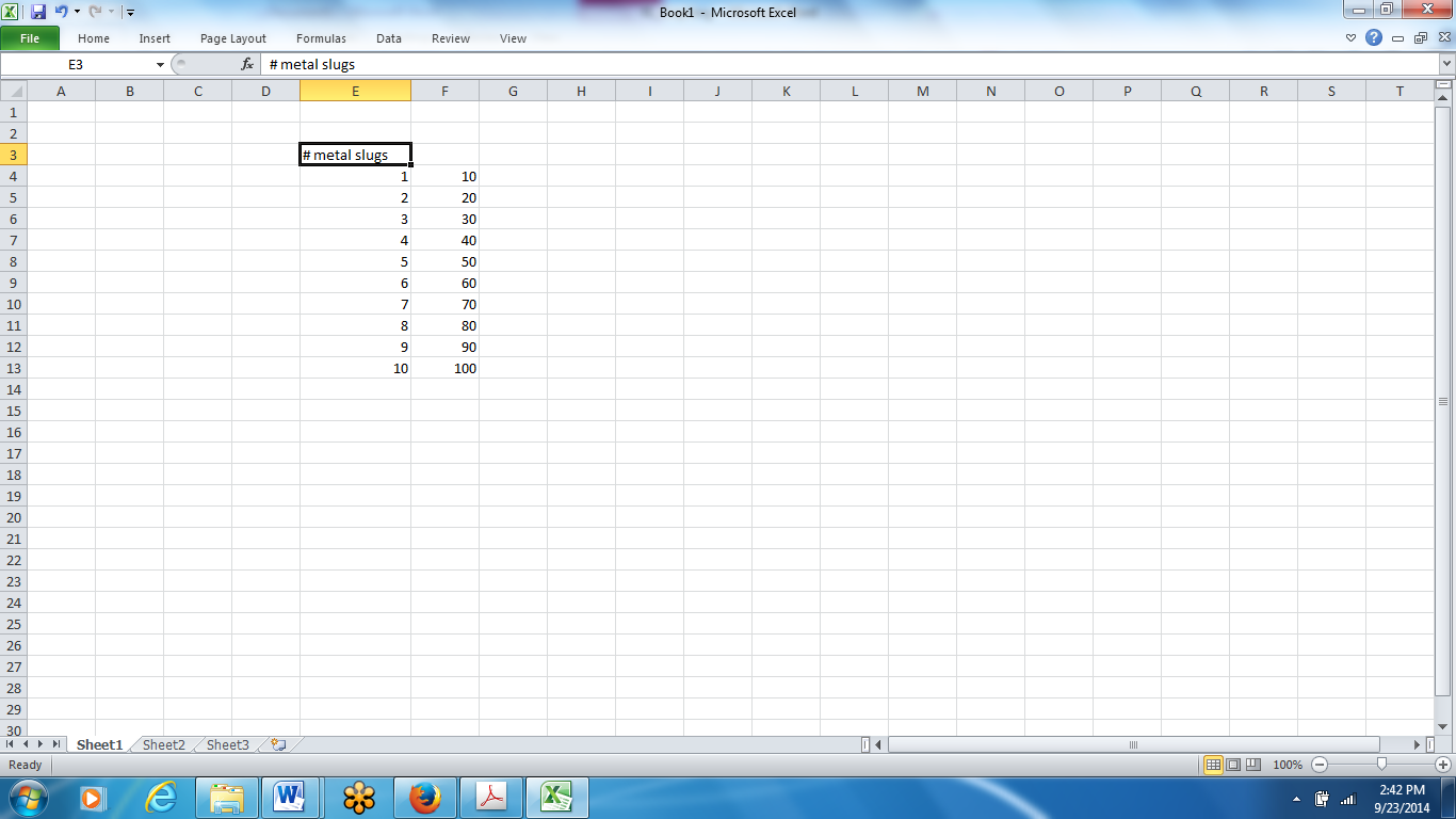
It is a good idea to give your entire data table a good title at this point. To do so, determine a good, descriptive title and type it into the cell that is 2 rows up from your left-hand column. In the case of this example, it would be cell E1. After typing the title, hit Enter:
Now to make it look nice, click back into the cell in which you typed the title (again, in this case, cell E1), and drag over and highlight the adjacent cell (cell F1):
 Next, click on the icon on the toolbar to merge cells. By merging cells E1 and F1, we create one big cell that is right above the data table, and by doing so, we can create a title that is centered right over your table:
(some of you may have to click the home tab to get to the tool bar)

The title should now be centered over your table. To make the title more prominent, simply click on the cell containing the title, then click on the B (for bold) icon on the toolbar:
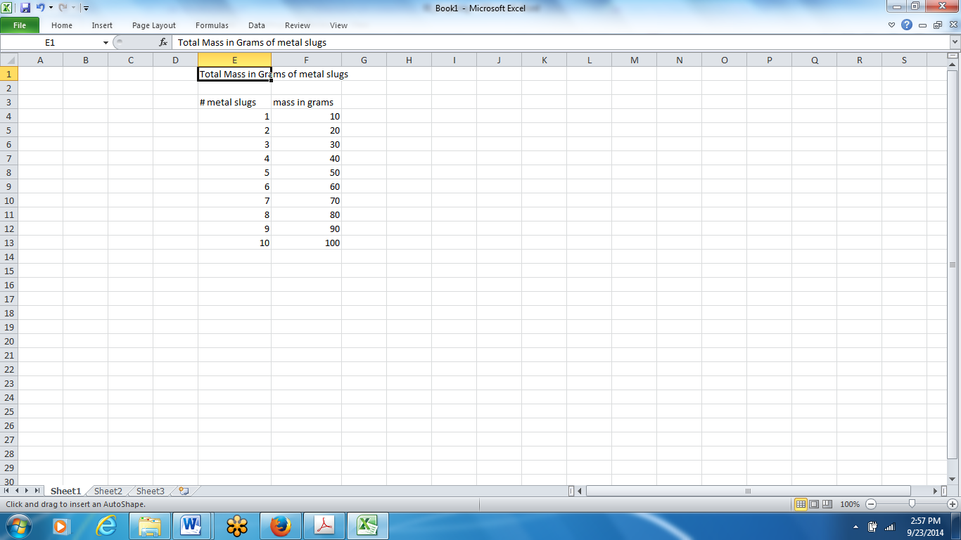
Your table should now look like this:
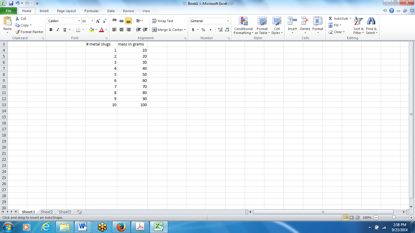
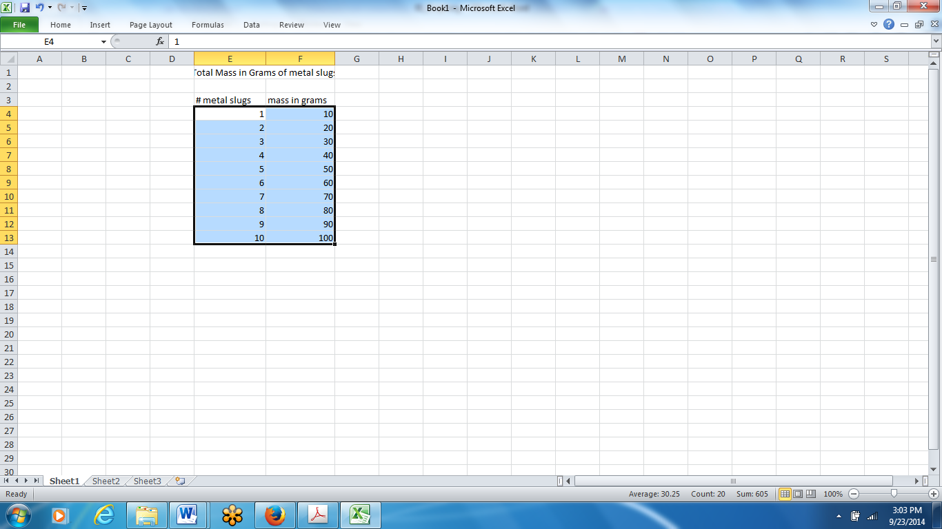
To graph this data, click on the top left cell containing your data, in this case, “1,” and click on the left mouse button and hold, and proceed to drag over and highlight all of your data:
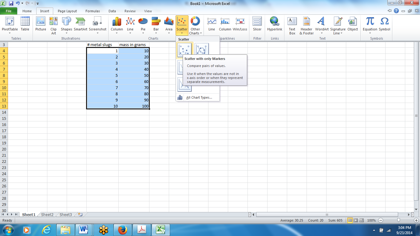
 Then, click on Insert on the top menu bar, and select Chart (or you could just click on the shortcut icon):
Next, select X-Y (Scatter) as your chart type, and select the very first chart sub-type. The X-Y (Scatter) graph is best for comparing values and is one of the most common types of graphs for scientific data. You may also need a bar graph in certain situations, in which case you would select Column as your chart type and again select the first chart sub-type. The rest of the graph construction procedure is pretty much the same whether or not you are creating a scatter graph or a bar graph, so the focus of this exercise will remain on X-Y (Scatter):
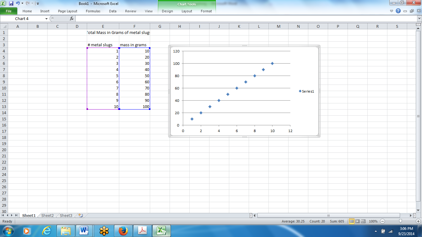
After clicking Markers only, you should see a rough sketch of your graph at this point. You should be able to “grab it and move it where you want it to appear next to data

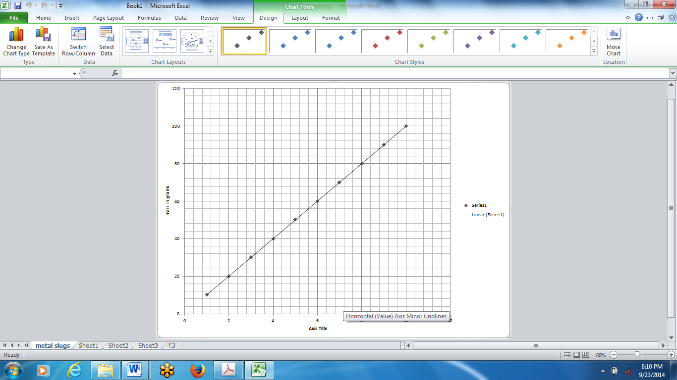
You are now given the option to enter appropriate titles on your graph. Click on Chart tools – then Chart layout – then choose the layout you want
Click on axis title, right click, edit text and type in your axis title – then hit enter – do this for both axis
You are now ready to move the chart, locate the move chart tab, click on it. Choose new sheet, name your chart and then click finish
Find equation of the line
Most of the time it is now necessary to generate an equation that represents the pattern of data expressed in your graph. To do so, place your arrow over one of your data points and right click, then select Format Trendline (this is NOT a generic “connect-the-dots” line—it is a line that sort of averages or reflects a smooth pattern in your data):
You need to select the type of line that seems to fit your data the best. Looking at the hypothetical data points for this particular experiment, it seems that the Linear type is best for this data. Sometimes, however, it may be best to select a logarithmic, power, or exponential line. You will have to evaluate according to which seems to fit your data the best.
Next check the boxes “Display equation on chart” and “Display R-squared value on chart”: (In the future, DO NOT perform this step if your experiment does not call for mathematical relationship of your data)
Save this chart with the file name (replace XXX with your last name):
Graphing Lab XXX
The R-squared value is important because it tells you how well your particular line represents your data. A perfect R-squared value is 1, so the value of 0.9952 above is pretty good. If you have a low R-squared value, it tells you that your data is statistically unreliable and not consistent, thereby decreasing the credibility of your data.


