Answered You can hire a professional tutor to get the answer.
1st discussion board Week 6.1 DiscussionReview table 14.3 attached below (example for DB 6.1). The table describes the four necessary skills and knowledge leaders need to be effective. For this Disc
1st discussion board
Week 6.1 Discussion
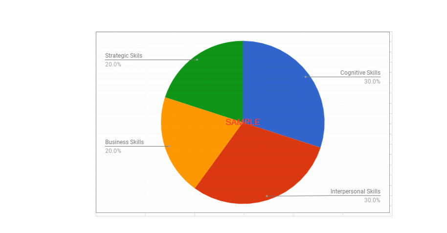
Review table 14.3 attached below (example for DB 6.1). The table describes the four necessary skills and knowledge leaders need to be effective. For this Discussion Board, you are going to use excel to create a pie chart that illustrates your evaluation of your level of competence in each of these four categories. Below is a link to the sample of a pie chart. Make sure that the individual pie chart slices add up to 100.
Here is a tutorial video that explains how to use excel to create charts and graphs:
https://www.youtube.com/watch?v=fnE-Yq771nM%20
Week 6.2
The second half of Chapter 14 focuses on different types, styles and practices of leadership. Specifically, the differences and importance of transformational and transactional leadership styles. Below is a video that further illustrates these two leadership types.
https://www.youtube.com/watch?v=HvS4OfxsbQU%20
For this assignment, you are going to describe three jobs (either that you have had, or that you want to have someday or some combination of the two) in terms of transformational or transactional. You will prescribe a percentage of you will create a graphic using Piktochart (https://piktochart.com/) that identifies the percentage of how much of the work of three (3) jobs (either that you have had, or want to have or some combination) is transformational and transactional. Give an explanation and example of each of the three jobs that you describe. Post your completed piktochart to this DB and provide a 150-250 word explanation of your graphic.
3 jobs I have had:
1- Special needs aid
2- Mechanic
3- Human resources specialist
3 jobs that you have had- what percentage of the work was transactional and transformational. Make sure that your percentages add up to 100. Below is a sample of a piktochart (made from scratch). Yours should look similar with the addition of your written explanation for the percentages for each job.
Below are two resources that demonstrate and explain how to use and create a graphic using Piktochart:
Resource #1:
https://www.youtube.com/watch?v=Eq-85gzw3GI#action=share
Resource #2:
https://www.brandman.edu/why-brandman/why-brandman/dedicated-resources/academic-support/multimedia-writing-and-design-support/mwds/graphic-design/piktochart
Here is an example of what your completed infographic should look like: (provided below as and attachment 6.2 pikto chart )
