Answered You can buy a ready-made answer or pick a professional tutor to order an original one.
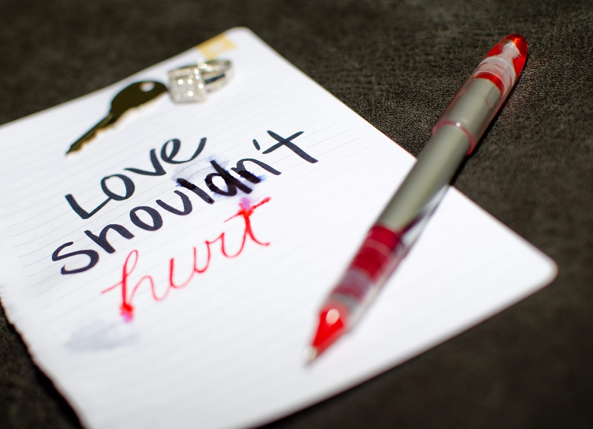
First artwork Soul Keepers Members: Courtney Harnois, Kareesha (Nia) Henry, Stephanie Jepson, Vivian Le Both artworks relate to an intimate form of violence. "Love shouldn't hurt," depicts a victim of
First artwork
Soul Keepers Members: Courtney Harnois, Kareesha (Nia) Henry, Stephanie Jepson, Vivian Le
Both artworks relate to an intimate form of violence.
"Love shouldn't hurt," depicts a victim of ongoing domestic violence finally leaving their abuser and sacrificing the things most sacred in order to do it.
Second artwork
"Comfort lies only in the untouched minds" portrays the sleepless, upended reality of victims who have suffered from sexual assault and are continuously haunted by the memory.
Each student will write a 100 word response in this forum. Choose ONE art piece that you wish to critique. Here's How:
I CHOOSE THE SOUL KEEPERS ART PIECE THAT I WISH TO CRITIQUE OR RESPOND TO. I ATTACHED THE TWO ART IMAGES TO RESPOND TO
This is one of my classmate respond
Hello Soul Keepers,
I really liked both artworks, but the one that stood out the most and had me looking at them for few minutes was the first one with the quote, "Love shouldn't hurt." I like how you all used negative space with a white piece of paper to contrast the paper's message and placement of the paper on top of a black background. It creates a nice contrast, great use of negative and positive space. Although the visuals are there, the emphasis seems to be clearly the message; the use of red for the word "hurt" and the fact that the background and visuals are a bit blurry, unlike the message that is focused it creates a focal point that instantly draws attention to the statement. The use of a key and a ring are very good visuals to represent the kind of ongoing domestic violence scenarios. I really liked that you all dropped water or a liquid on the paper to simulate tears in the sheet of paper. It gives the spectator a visual of the word "hurt," again creating a good representation of things. Lastly, great distribution of things in the art piece, the angle the picture is taken, where the pen is, the ring, and the key create a sense of balance. Question: What guided you all to include the red pen on the image. It sure draws attention to the art piece, but what was the thought process behind it? What ideas guided you to place the pen in an opposite diagonal to the sheet of paper? Opinion: I think you all did a great job representing the message of domestic violence; the details like the tears and the visual of objects the key, and the ring really project the message. Also, as I already mentioned, the pen being diagonally opposite the sheet of paper does a great job as an attention-getter. In my opinion, it fills up the empty space to the right of the picture, creating balance. Awesome job!
- @
- 2086 orders completed
- ANSWER
-
Tutor has posted answer for $10.00. See answer's preview
********